Color Splash: Living Rooms

February 27, 2013


Do you ever wonder how to add splashes of color to an overall neutral space? It's a great way to liven up any space without overdoing it. Plus, if you get tired of your splash of color - it's an easy switch. You can always change what splash of color you want when you chose pieces that are interchangeable. For example, the living room above is a classic charcoal, but when adding splashes of pink with fabulous pillows and accessories - the whole space doesn't feel so dark. And the good part is that you can easily change these pillows and accessories to any accent color - turquoise, yellow, plum, etc. Most colors do go with gray nicely -  I love it!


Now this living room above has a much lighter and open feel as you can see with all of the natural light. Much of this room are neutral colors - beige, tan, cream, and white. Fabulous yellow and mustard accent colors are used in the window treatments, pillows and decor. Once again, you don't have to paint a room yellow or an accent wall to get the bold look you are looking for. These yellow accent pieces are also easily changeable - switch the pillows and window treatment to any accent color you would like!


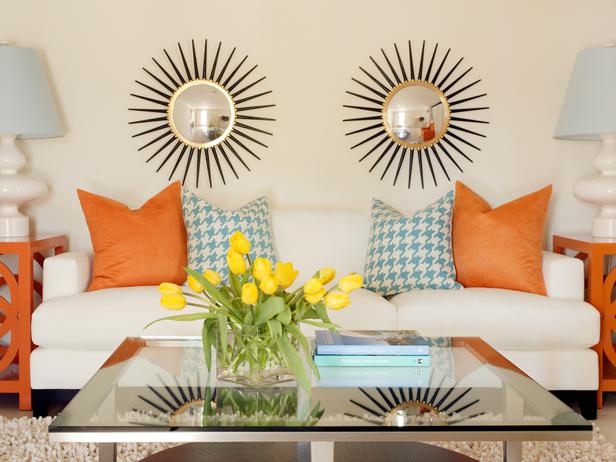
Above, one may question why the couch and wall color are the same, but I think it was a smart choice considering the fun, colorful elements that act as the bold statement here. The cream couch and walls paired with orange side tables and colorful accent pillows transforms this rather neutral space into a fun and exciting living room. The side table and pillows can also be easily changed to feature a different accent color at any time!


This living room above is different from most. Not everyone would be willing to add such colorful window treatments to a rather neutral space. I especially love how these treatments are a fun ikat print - love this print! (If unsure what ikat is, check out this post where I tell you all about ikat). I also love that this space paired gray with mustard yellow and tans. It really works and the window treatments add that playful element to a rather sophisticated space.


Turquoise and pink/coral are my favorite! Here, more of a robins egg blue is used as the wall color which is very popular right now. The wall color choice isn't too bold and any accent color can be picked from all the different colors in the window treatment. Here, pink is used as the accent color but yellow can also be used and still work with the space and existing window treatment. Love this space!


If you haven't already, now you know that you don't have to paint walls or use large colorful pieces of furniture to make a bold statement in your living space. You can choose neutral wall colors and pieces of furniture and by adding colorful accent pieces that are changeable you can liven up any neutral space and change accent colors as often as you like, easily. I hope you love the examples I have used here as much as I do! What is your favorite accent color?


Xo,


Trendy Color Duo: Navy & Coral

February 23, 2013


My bedroom walls are coral and the accent color is gray. Although that pairing is gorgeous, I have noticed how amazingly beautiful and trendy navy and coral has become. If you aren't afraid to go bold I would suggest using this color combo on your next home project! I know I will. Here I have posted some great navy and coral inspiration so you can see what I am talking about. 


This navy and coral living space is my favorite! Pairing the trendy colors with prints such as chevron and stripes make the space even more aesthetically appealing. I also love how they used more neutral colors for the other pieces of furniture and rug. It really draws your eye to fabulous couch and accent pillows. Everything about this space is beautiful.


This space uses a richer coral and navy. Again, pairing these colors with neutral pieces of furniture and decor such as the white lamp, walls, coffee table and a white couch makes the coral and navy pieces make a bold statement. This space has a very "homey" feeling to it as well.


Here, they painted the walls bold coral but has a cottage chic feel to it with the white furniture and wall collage. The navy couch and white desk are the perfect pieces against the wall color. This is a showroom space but gives the feeling that this space is totally doable in your own home.


This space has more of a navy and bright coral color scheme. Here, the space is mostly navy and white with coral accents which allows the bold printed rug to really work in this space without being too bold. I could definitely picture myself being happy to come home in this space!

This is a light coral paired with navy. Gold and white decor work especially well in this home office. I love everything about this space!


I hope that I persuaded you to love this color duo as much as I do - although I don't think I need to persuade much. I love these colors with a bold print - done the right way like all of these spaces. Will you look into some navy and coral in your home? 


Xo,


Crazy for Chevron

February 18, 2013


Chevron(n):
A line or stripe in the shape of a V or an inverted V

Chevron has been around for a long time but if you asked me what chevron was a couple of years ago, I wouldn't have known. I knew what zig-zags and stripes were, but when I knew what chevron was, I fell in love with it. I would say that chevron is the classy and retro inspired version of the zig-zag. This trendy print is everywhere - clothes, curtains, pillows, bedding, rugs, artwork, and even stairs. I want to share some of my favorite ways chevron has been used.


The use of this chevron print made me want to do this in my house one day! It definitely makes a statement but there is not much going on color wise with the rest of this entryway so this black and white chevron rug totally works.

The chevron makes a noticeable statement as an accent wall in this elegant bedroom. Not only is the chevron trendy but the suzani print accent pillows are also. Top it off with a starburst mirror and this space is truly beautiful and stylish.

You don't have to use chevron only as an accent wall - why not use it on the ceiling? I love how elegant and glamorous this bedroom is. The crystal chandelier looks gorgeous hanging from the ceiling and the chevron works perfectly with the space.


I love this bedding set. It's so simple but with the chevron and metallic stitching adds just enough interest to the space.


This chevron print is bold as an accent wall but because it is gray and the splash of color is turquoise, it doesn't over power the space. I love the colors in this teen bedroom!


This painting is an original painting by myself - I love black and white chevron as a background for any painting because then you can add any splash of color you like. In this case I chose shades of turquoise and gray. I didn't want to go crazy with the floral print on top of the chevron print but I loved how it came out! I can tell you one thing- this one sold! 

This painting is by Jennifer Moreman. I love abstract art & the look of the chevron print in this painting and the colors chosen work perfectly together. I just recently bought a chevron bathing suit bottom from Victoria Secret with the same colors after seeing this painting! 


If you didn't know already, now you know all about chevron and I hope you love it just as much as I do. Do you have any chevron in your own home?
(Sources: Etsy, Anonymous)


Xo,


Mirror Mirror on the Wall

February 13, 2013


Mirrors in a space have a lot to offer - a more spacious looking room, reflection of light, decoration, and can act as a window element. I have seen some great uses of mirrors in designs featured on the HGTV website and also with the design firm I intern for, DLT Interiors. I wanted to share the different ways mirrors can be used because they are the go-to decor item these days.


Here, Andreea Avram Rusu has created a fabulous window look with the use of a mirror that has great detail. You can also see how much light is being reflected from the opposite window.


Here, Debbie Travin has used 4 mirrors to create a focal point over the bed. It reflects the light and the soothing colors in the space.


These mirrors Debbie Travin has also used as a focal point in an elegant and fun living space. 

Jennifer Duneier is also a fan of using more than one mirror to create a beautiful statement piece. 

Oversized floor mirrors, like this one Celia Berliner has used, adds the illusion of a larger space when placed in a smaller room. 

I LOVE frame collages but this mirror collage looks especially beautiful and rustic. This design was inspired by a uniform piece by Anthropologie that you see on the right. SZInteriors has recreated this look that you see on the left by using a collection of antique mirrors and placing them together. Brilliant and beautiful!


As you can see mirrors can be used in different types of rooms and in different ways. You also don't have to break the bank. I am a BIG fan of them and think they add that extra needed something when designing a space. Do you have mirrors in your space? Till next time :)


Xo,


New York Design Center: 200 Lexington

February 7, 2013

Photo credit goes to hereinthishouse.com


Does the 200 Lexington building sound familiar? At 200 Lexington Avenue in New York City is the New York Design Center. This past week was my first time in this building in which it reminded me a lot of the D&D (Decoration & Design) Building on 59th and 3rd ave. Walking into the building you see a bunch of vignettes of different showrooms that are in the building. It is also where you can look at the directory to find one of the hundreds of showrooms located here. Like the D&D you would need a designer account set up with the different showrooms in order to request samples.

The trip I took there with the designer I assist, we planned to stop into Arteriors (known for their beautiful lamps) and Lee Industries which is featured in the Apropos showroom. Realizing that Kravet also had a showroom here, we decided to stop in there as well to look for some grass cloth wallpaper (very popular right now - almost all the samples we requested they had out) and fabric for a different client. I wanted to show some of the pictures I had taken in Arteriors this past week because I fell in love with their showroom and the style of their one of a kind lamps:


As I had walked in I was drawn to the industrial, rustic look of this chandelier. Because even though it  has a masculine feel about it, the chrome gives it the perfect shine.


I love the sleek, sophisticated look of the brass lamp toward the right. And I am a big fan of the nesting tables. If you want to save some money,  Pottery Barn has similar, rustic looking ones here.


Walking around admiring Arteriors showroom, I came across a lot of bleached wood furniture and accessories. I am not surprised this is a really popular look, it is gorgeous.


Here is just one wall of table lamps they have in all different colors. 


I love the floor lamp in this picture, which is the lamp we actually went in to find. Except it came with a different shade we wanted and was larger than the picture. The good thing though is that the shades do come with the bases here. 


I hope that the style of Arteriors inspires you as much as it inspired me! Below I have made a link to each of the showrooms that I have mentioned in this post including the New York Design Center where you can find more information and see a full list of their showrooms. Talk soon :)


Xo,


Trending: Ikat Print

February 6, 2013


Ikat (n): A dyeing technique that creates unique prints. The word ikat derives from the Indonesian word mengikat 'to tie'.


I have been in multiple showrooms in the D&D Building in Manhattan where I have seen amazing ikat prints recently (Above picture: Kravet/Brunswig & Fils). The more I see ikat print the more I fall in love with it. So, I wanted to write a post about this print since it has been around but becoming more and more popular. 


Ikat fabric can be used in many different ways:

A roman shade in a kitchen.


A fabulous accent pillow.


An entry way table cover.


A one of a kind upholstered couch.


As the splash of color in an elegant dining room.


As a unique print on a rug.

You can even wear the trendy style yourself.


You can also buy ikat dishware.


Ikat can be used in a variety of ways to make a certain piece of furniture or product stand out, that's what is so great about it! This look can also be very transitional. Keep in mind that you don't have to use bold colors when picking this print. Ikat also can be quite suttle such as a taupe ikat chevron print. I personally love chevron (most people think of zig zags when using the term chevron). I hope that this post opened up your mind to a (somewhat) new type of print that you will be inspired to use somewhere in your home. I know that etsy.com has many different ikat pillows, curtains, etc. If you're looking for inexpensive, I would check Etsy out! Till next time :)

Xo,


Picture credits go to: Kravet, Brunswig &Fils, Stark, Zunga Interiors, Housebeautiful, Melissa Jennings, Thefind, Chiccoles


Creating an Interior Design Board

February 4, 2013

How can you portray all of your great ideas to your client? It's quite simple. Using a design board you can place fabric samples, carpet samples, cut outs of furniture and paint colors. You may notice the term design board is interchangeable with the term mood board in interior design. You can also put on the actual inspiration cut outs that your client may give you. Using REAL color and material swatches will help make your design board as realistic as possible and much easier to convey your ideas to the client. 

Make sure you only have about 1-3 samples of a particular product. For example, display only 2 or 3 carpet samples on your design board because it may become too overwhelming for your client to handle if you put any more than that. Obviously, as an interior designer your job is to narrow it down as much as possible for your client. I am going to show you some examples of how I, working cohesively with the interior designer herself, have created a design board.


Above I am in the process of figuring out the placement of all the samples and furniture cut outs. What you see above are samples for a dining room, living room, guest room and bedroom with the correlating floor plan.


I later choose that the best idea is to put the bedroom on a separate board, so I cut the bedroom off of the whole floor plan and added it to my bedroom design board. Here you can see all of the fabric and carpet samples, paint colors, furniture cut outs and the actual inspiration the client has given from a magazine. The only thing I would change in the future is to print out the furniture larger to be able to see more detail and add borders around the furniture to stand out.

Above is the design board of the guest room (bottom left and fabric top left), living room (top middle/left) and dining room (top middle/right). There were 3 rooms on this one board. The carpet sample was to be used in three areas (dining, living and lounge area) since it is all one big space and the statement would be the printed curtain fabric (top right). Also, you can see on the top right is a cut out given by the client which is the inspiration in which the color scheme was made. 

You can see on the floor plan, I had cut out to scale each new furniture piece to see how it fits in the clients space. In the future I would include, to scale, the furniture pieces the client decided to keep in order to get a full visual of the furniture placement and size.


Above are the finished design boards being presented to the client. The colors that were picked for the young couple clients were very relaxing and the furniture is very eclectic with fun geometric patterns. I wish I could of recorded the clients reaction because she loved it!


As an interior designer, you want to be able to convey your ideas easily and simply to your client. They should be able to really envision their new space with all of your ideas. The boards in this post have specifications such as name of product, the store, dimensions and price on the back of the pictures since they are only taped onto the board. The other option would be to place numbers under each piece of furniture and then on a separate space on the design board list the numbers with the correlating information for each product. That would help if you plan on gluing down the papers and would be easier to find out that information. I hope that my experience with these design boards and my tips help you create your own outstanding design board! Till next time :)


Xo,