Robins Egg Blue: Do You?

May 18, 2013


Robins egg blue is a timeless color that can work into many color schemes or be great on its own. I am currently in the process of redoing a bedroom in my home and have chose this color for my walls. Robins egg blue looks great with most colors especially red, yellow and coral which are my personal favorites. Here I would like to show you some of my favorite robins egg blue theme rooms and accessories. 

In the above dining area, robins egg blue is paired wonderfully with warm neutral colors such as beige and cream. Robin egg blue acts as the pop of color without being too dramatic and still feels light and inviting.

Above, robins egg blue acts as a neutral with yellow as the pop of color in this vintage chic living space. 

In this bedroom, robin egg blue can work with all shades of blue - from baby blue to navy blue. Paired with other trending yet timeless prints such as ikat, this bedroom can work in any style home. 

Above, robins egg blue is used more as an accent color in the side chair and end table. Here you can see that this color works well with other accent colors such as orange, green and yellow. 

Robins egg blue looks just as good when using it in your home decor and accessories. Paired with another trending print such as chevron and with traditional pieces such as the blue and white temple jar, it really works well no matter what style you are going for.

Being a fan of large floral prints and linen, I am a bigger fan of this pillow. I love the natural linen in this pillow and the embroidered robins egg blue print makes it come alive. 

 There is something very eclectic about this color and it especially looks good with vintage looking pieces. I can picture these frames on a neutral wall such as taupe or even a bright yellow wall and they would look great with either color scheme. 


As you can see, there is much you can do with this color and I would take advantage of it like I am because it is one of the top colors in design right now. I hope this inspires you to add a little robins egg blue into your life!


Xo,


The High or the Low?: High End Looks on a Budget

March 13, 2013


Have you ever found the perfect piece for your living space and then found it was out of your budget? Whether you are looking for glamorous pieces of furniture to make a bold statement or simple pieces that are multi-functional, when looking in the right places you can find similar pieces that won't break the bank. Here are some low price pieces that look just as good as the high, if not better. High or low? You be the judge.


The starburst mirror is quite trendy right now but you don't have to splurge to have such beautiful decor. On the left is the low, the Devon Mirror found at zgallerie.com comes to only $199. On the right is the high, the Shelby Gold Leaf Mirror found at worldsaway.com which is known for their beautiful but mostly costly pieces of furniture and decor.


You always want a chandelier to be a statement piece over your dining table or in the center of any space. Both of these chandeliers are glamorous and carry the same antique look despite the large price difference. On left is the high, the Viola Ivory Beaded Chandelier by Arteriors found at laylagrace.com for $2,520. On right is the low, the Arabella Beaded Chandelier found at potterybarn.com for only $299.


This quadrille print pillow is a trendy yet timeless print that can work great on its own or paired with other fabulous accent pillows. The steal and the splurge look identical in this case - the high on the left is the Zig Zag Grande Navy Pillow found on Oomphonline.com for $385. The low on the right is a pillow cover made with the quadrille print fabric designed by Alan Campbell from etsy.com for only $85.


Lighting is important in every space, not only with a remarkable chandelier but also with accent lighting. On left is the low, the West Elm Perch Table Lamp found at westelm.com for $69. On right is the high, the Clear Glass Lamp by Arteriors found at laylagrace.com for $480. Both deliver the same look for a large price difference.


Simple pieces can also come with a large price tag, but you can find the perfect low and won't be able to tell the difference. On left is the low, the Parsons Desk part of the Parsons Collection found at westelm.com for $349. On right is the high, the Parsons Grasscloth Desk found at bungalow5.com which are known for quality and sometimes costly pieces that only designers are able to purchase for their clients.

It can be difficult to find a large size area rug made with 100% wool for a reasonable price - but on the right is the Homespun Nawra Trellis Navy Rug handmade of 100% wool for only $732 found on rugsusa.com. The high is on the left - the Panthea Flatweave Rug from Horchow.com for $1,599. Here the low offers the same contemporary trellis print as the high at more than half the cost.


You can see from all these high and lows that you can get the same look at a budget friendly cost from lighting to decor to glamorous pieces of furniture. West Elm, Pottery Barn and Z Gallerie are only a few of the many reasonably priced stores that offer the same high end look with a low price tag. This will allow you to splurge on those other pieces that you may have your heart set on!


Xo,


Color Splash: Living Rooms

February 27, 2013


Do you ever wonder how to add splashes of color to an overall neutral space? It's a great way to liven up any space without overdoing it. Plus, if you get tired of your splash of color - it's an easy switch. You can always change what splash of color you want when you chose pieces that are interchangeable. For example, the living room above is a classic charcoal, but when adding splashes of pink with fabulous pillows and accessories - the whole space doesn't feel so dark. And the good part is that you can easily change these pillows and accessories to any accent color - turquoise, yellow, plum, etc. Most colors do go with gray nicely -  I love it!


Now this living room above has a much lighter and open feel as you can see with all of the natural light. Much of this room are neutral colors - beige, tan, cream, and white. Fabulous yellow and mustard accent colors are used in the window treatments, pillows and decor. Once again, you don't have to paint a room yellow or an accent wall to get the bold look you are looking for. These yellow accent pieces are also easily changeable - switch the pillows and window treatment to any accent color you would like!


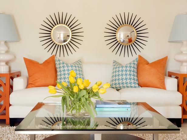
Above, one may question why the couch and wall color are the same, but I think it was a smart choice considering the fun, colorful elements that act as the bold statement here. The cream couch and walls paired with orange side tables and colorful accent pillows transforms this rather neutral space into a fun and exciting living room. The side table and pillows can also be easily changed to feature a different accent color at any time!


This living room above is different from most. Not everyone would be willing to add such colorful window treatments to a rather neutral space. I especially love how these treatments are a fun ikat print - love this print! (If unsure what ikat is, check out this post where I tell you all about ikat). I also love that this space paired gray with mustard yellow and tans. It really works and the window treatments add that playful element to a rather sophisticated space.


Turquoise and pink/coral are my favorite! Here, more of a robins egg blue is used as the wall color which is very popular right now. The wall color choice isn't too bold and any accent color can be picked from all the different colors in the window treatment. Here, pink is used as the accent color but yellow can also be used and still work with the space and existing window treatment. Love this space!


If you haven't already, now you know that you don't have to paint walls or use large colorful pieces of furniture to make a bold statement in your living space. You can choose neutral wall colors and pieces of furniture and by adding colorful accent pieces that are changeable you can liven up any neutral space and change accent colors as often as you like, easily. I hope you love the examples I have used here as much as I do! What is your favorite accent color?


Xo,